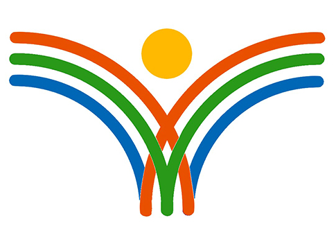
The logo of Kishoree Foundation represents its foundational vision and mission of well-being and progress of humanity as well as ideals of sustainable development.
The symbol of an all-embracing human form, discernible in red-orange intersecting outermost quarter circles and yellow dot, signifies humanity’s aspiration to be inclusive, to prosper and flourish, and to become healthier, educated and perceptive. The logo also signifies the imagery of a person’s yearning to fly and be free, and thus the ideals of freedom and liberty to pursue her or his happiness and advancement. Red-orange and yellow representing enthusiasm, creativity, positivity, energy and optimism – are also the foundation’s abiding motivations.
The green quarter circles, representing sapling is inspired from our and humanity’s commitment towards sustainable, harmonious and energetic efforts, while also caring for and preserving life, nature and environment. The reinforcing and buttressing blue arches represent foundation’s deeper commitment towards and enduring trust in values of rationality, wisdom, truth, justice and fairness while striving to achieve its vision.
Some of us can also visualize the logo as a rotated English alphabet ‘K’ standing for Kishoree!
‘Kishoree’ is a Hindi word meaning an adolescent girl. In many senses, foundation’s activities, programs and efforts would be tilted towards taking up issues related mostly to girls, women and children, and hence the name ‘Kishoree Foundation’. However, the foundation’s vision is welfare of all, and our approach would always be inclusive, fair and just, though geared towards disadvantaged, poor and downtrodden sections of society.
Kishoree Foundation © 2019, All Rights Reserved.